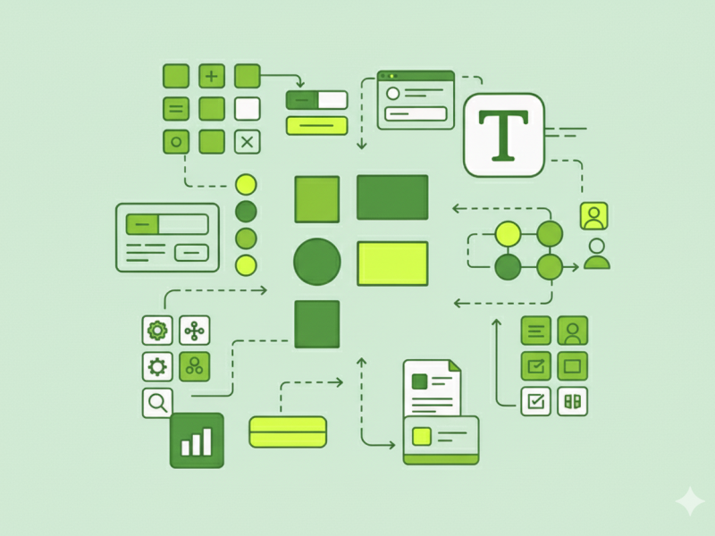
Design systems are more than just a collection of components; they’re the DNA of your product, ensuring consistency, efficiency, and scalability. In the ever-evolving landscape of digital design, a well-structured Figma design system is no longer a luxury but a necessity. For designers, mastering this skill is crucial for creating cohesive and maintainable products.
By treating your Figma design system as a product and prioritizing collaboration, you’ll create a powerful tool that not only streamlines your design workflow but also fosters a more consistent and efficient product development cycle.
The Foundation: Styles and Variables
The building blocks of any effective design system are styles and variables. Instead of hard-coding values for colors, typography, spacing, and effects, you should define them as variables. This practice allows you to make a single change that propagates throughout your entire design.
For instance, you can define a color palette in a dedicated “Brand Collection” of variables. Then, create an “Alias Collection” that references these foundational colors with semantic names like color-bg-primary or color-text-on-background. This architecture allows for easy theming (e.g., light and dark modes) and ensures consistency across different contexts.
The Component Library: Variants and Properties
Once your foundational styles are in place, you can build your component library. Components are reusable UI elements, like buttons, cards, or input fields. In Figma, you can use variants to create different states or versions of a component within a single set. For example, a button component might have variants for default, hover, pressed, and disabled states.
Component properties—such as text, instance swap, and boolean properties—make your components even more powerful and flexible. They allow designers to customize instances without “detaching” them from the main component, maintaining a clean and scalable system.
Organization and Structure
A great design system is easy to navigate and understand. Consider a modular approach to organizing your files, separating them based on function:
- 00 Foundations: This file should house all your design tokens and variables for colors, typography, spacing, and effects.
- Core Components: This is where you’ll keep your atomic, highly-reusable components like buttons, icons, and input fields.
- Advanced/Pattern Components: Here you can store more complex components or patterns built from your core components, such as a navigation bar or a hero section.
- Documentation and Playground: A dedicated space for documenting your system’s guidelines, usage rules, and examples. It’s also a great place for designers to test and experiment with components without affecting the main library.
This modular structure helps with version control, reduces file sizes, and makes it easier for different teams to use only the parts of the system they need.
The Human Element: Collaboration and Documentation
A design system is a living document that requires ongoing maintenance and collaboration. It’s not just a solo project; it’s a shared resource for designers, developers, and other stakeholders.
- Engage with Developers: Work closely with developers from the beginning. Understanding their technical limitations and building a shared vocabulary for components and tokens is crucial for a smooth handoff and implementation.
- Prioritize Documentation: Don’t let documentation be an afterthought. Documenting component usage, accessibility considerations, and best practices is what makes the system truly useful and reduces confusion. You can embed this documentation directly within your Figma files and link to a more detailed external knowledge base.
- Create a Community: Encourage feedback and contributions from your team. A design system is more likely to be adopted and maintained if people feel a sense of ownership. Establish a clear contribution process and celebrate wins to keep the momentum going.
By treating your Figma design system as a product and prioritizing collaboration, you’ll create a powerful tool that not only streamlines your design workflow but also fosters a more consistent and efficient product development cycle.
Comments